Spatial Analysis with Carto
- busranurbekman
- Jul 13, 2023
- 3 min read
Blog Post: Ozge Eda Kaya
Carto is a cloud-based mapping application that enables the creation of interactive, online maps. The platform, which helps users to visualize spatial data and analysis. It requires users to have geospatial information, usually in the form of latitude and longitude columns to plot data on a map.
Unlike other mapping services, Carto supports the upload of various data formats and enables easy integration into websites.
You can use different components of the Carto platform for visualization, analysis, or data access. In this article, we will use Carto for spatial analysis.
Creating Interactive Maps with Carto
Carto allows for storing, enriching, visualizing, and spatial data. Carto’s Builder interface is a mapping tool for designing and publishing interactive web maps with location data.
In this article, we will conduct a study based on the 1885s population census, showing a population density of men and women on a neighborhood-by-neighborhood basis.
Map Creation with Carto
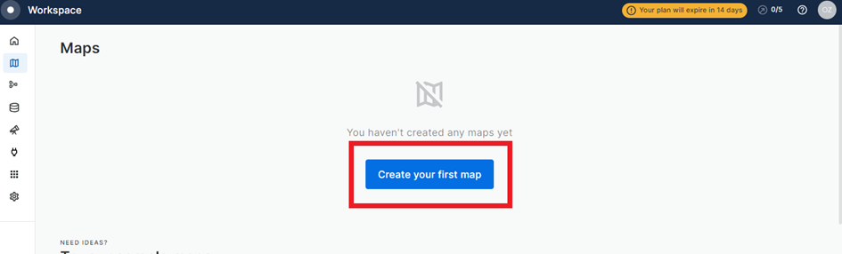
First of all, you need to create an account on Carto. You can create a Carto account by clicking on this link and accessing the trial version for 14 days.

After opening Carto Builder, click on “+Add Source”.

While you can use Carto’s sample data with the “Data Explorer” option in the Add Source tab. You can also work in the Carto Data Warehouse (based on Google BigQuery) with “Custom Query (SQL)”. It is also possible to upload your work file to Carto from the “Import File” option.

Carto allows uploading multiple file types such as Shapefile, GeoPackage, CSV, and KML to the system.
When we upload the 1885 census, which is the subject of the application in this article, into Carto, we see that the neighborhoods included in the census in İstanbul are distributed as follows.

To make changes to the file you uploaded, you can click “More Options” in the “Source” section and make the changes you want to the data you uploaded.

You can also Access your data without leaving the application with the “Show Data Table” option in this section.

“Map ground” and “layer name” changes on the main map are made from the options in this section. Especially since there should be no Turkis characters in the data set you uploaded to Carto, you can quickly correct the layer names using Turkish characters from this section.


You can also change the color, size, and type of the layer you added to the map from the “Layer” option.

On the screen that will open after clicking on the “Layer Style” option, you can decide how to visualize the data on the map. With the “Label” option; you can decide which data in your data set you will apply on the map.

For example, when we want to create a map with Carto based on the neighborhoods included in the census in the Üsküdar region, it makes the maps in just seconds.

When we add the “Total Population” data to the “Neighborhood Names” data, we reach this map;

If we add the “female” and “male” data to the map, we see the population distribution in Üskudar neighborhoods on a female and male basis.

In addition to all these when we create a different layer over “Daire-i Belediye” in Carto from the dataset; it becomes possible to see the area covered by the “Daire-i Belediye” throughout İstanbul.

If you want to work on a single layer after adding multiple layers to the map; you can access the three-dimensional image from the options in the center of the map. You can carry out different studies on a double screen.

Finally, you can also share your map with the “Share” button on the top right!
Ozge Eda Kaya
Istanbul Medeniyet University
Ph.d candidate


Comments